Blue in Berry

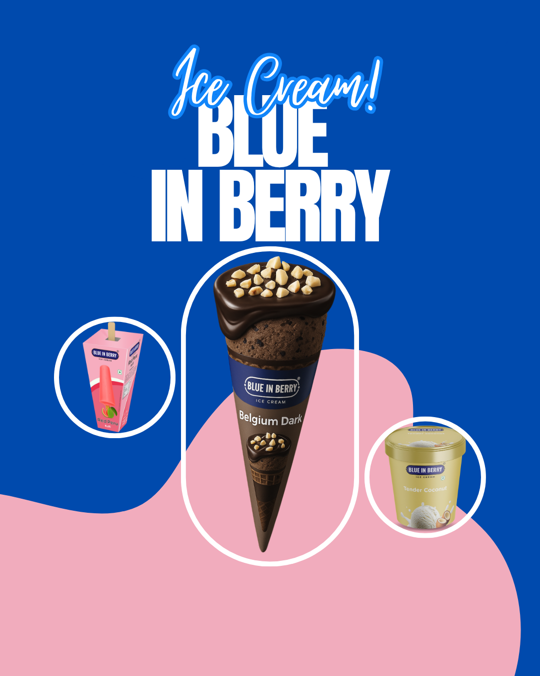
Understanding the Brand Vision

Blue in Berry is a vibrant ice cream brand that celebrates bold flavors, natural ingredients, and a youthful personality. When the brand approached us, they wanted packaging that could tell their story — fresh, fun, and full of flavor. As an IT and creative solutions company, our goal was to merge strategic design thinking with artistic storytelling to create packaging that would connect emotionally with customers and visually stand out in a crowded retail space.


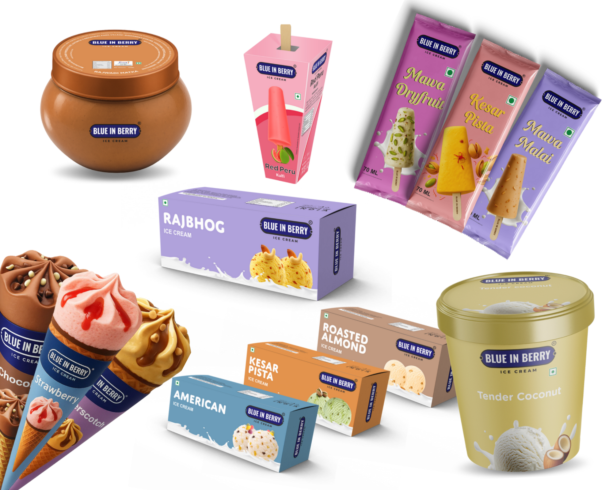
The Challenge: Standing Out in a Saturated Market

The frozen dessert category is filled with visual noise — bright colors, complex graphics, and repetitive layouts. Blue in Berry needed a distinct identity that communicated premium quality, natural freshness, and playful indulgence all at once. The existing design lacked coherence and personality, failing to capture the essence of the brand. Our challenge was to craft packaging that instantly conveys freshness and flavor while maintaining a clean, modern look that aligns with the brand’s youthful tone.

The Creative Process & Design Strategy

We began with deep research into color psychology, consumer behavior, and retail visibility. Inspired by the brand’s name, we built the visual direction around blue and berry tones, symbolizing freshness, trust, and flavor.

Our designers developed a modular system — each flavor with its own unique accent color, yet all tied together by a cohesive brand language. We incorporated minimalist fruit illustrations, clean typography, and structured layouts to highlight the product’s natural appeal. The design focused on balance — enough visual energy to attract attention, but subtle sophistication to build trust.

Execution & Technical Detailing

Once the creative direction was approved, our team developed print-ready packaging artwork across multiple SKUs and product sizes. We collaborated with the client on material selection, ensuring that the packaging would look as good on-shelf as it did on-screen.

We recommended matte lamination with selective gloss finishes, enhancing tactile engagement and premium perception. Every visual element — from icon placement to color contrast — was meticulously optimized for legibility, brand consistency, and printing accuracy. The result was packaging that feels both premium and playful, perfectly capturing the Blue in Berry experience.

The Impact: A Fresh Look that Drives Recognition

The redesigned packaging brought a complete visual transformation for Blue in Berry. The new look created instant shelf impact, improved consumer recall, and positioned the brand as a modern, trustworthy, and aspirational choice in the ice cream market.

The project not only enhanced the brand’s retail identity but also demonstrated how [Your Company Name] bridges creativity and technology — delivering end-to-end design solutions that elevate products and strengthen brand storytelling. Through strategic thinking and creative craftsmanship, we helped Blue in Berry turn every scoop into a visual delight.