Yash Group

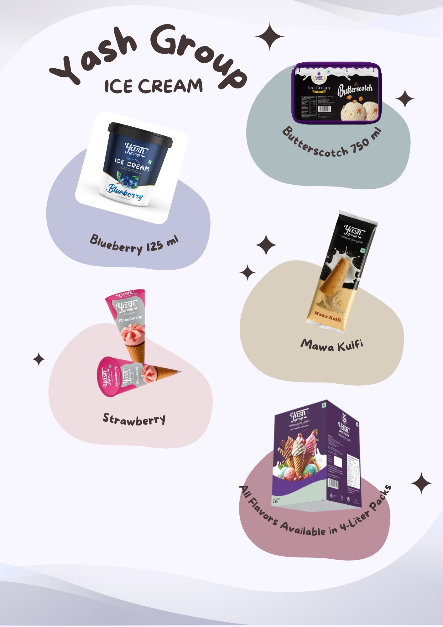
Understanding the Client’s Vision

Yash Group, a well-established ice cream manufacturer, approached our team with a mission — to give their brand a fresh, modern visual identity that could match their reputation for quality and taste. They wanted to create packaging that felt vibrant, premium, and emotionally engaging while maintaining the trust and familiarity they had built with customers over the years. The client’s brief focused on crafting an identity that reflects the joy of indulgence and the comfort of tradition, appealing to both loyal customers and a younger, style-conscious audience.


Identifying the Core Challenge

The ice cream market is visually crowded — every brand fights for consumer attention with color, texture, and storytelling. Yash Group’s existing design had lost its edge, appearing too traditional to resonate with the fast-evolving visual culture of today’s audience. Our challenge was to create a packaging system that felt refreshing yet recognizable, one that represented the brand’s long-standing heritage but with a forward-looking design language. The new visual identity had to communicate freshness, flavor authenticity, and premium quality while being flexible enough for multiple product lines.

Blending Creativity, Strategy, and Consumer Psychology

We started by immersing ourselves in the world of Yash Group — studying their brand values, flavor lineup, and consumer base. Our team conducted visual and behavioral research to understand how customers perceive ice cream packaging in retail environments.

Based on these insights, our design direction focused on visual freshness and emotional connection. Each element — from color to texture to typography — was chosen to evoke the feeling of indulgence and happiness.

Key Creative Principles We Followed
  • Color as a storyteller: Every flavor received its own distinct color tone that immediately communicates taste and personality.
  • Appetite appeal: We incorporated high-quality, close-up product imagery that makes each pack irresistible.
  • Consistency with flexibility: While each variant stands out individually, the overall design language ties the brand together as one cohesive family.
  • Typography and layout harmony: Clean yet bold fonts were used to create a contemporary and confident look.

Bringing the Vision to Life — The Packaging Design Execution

Our design process moved from mood boards and sketches to digital prototypes and mockups. Each concept was refined until it achieved the perfect balance between premium aesthetics and mass-market appeal.

The Final Packaging System Included
  • Distinct flavor identity: Color-coded designs for instant recognition and stronger shelf differentiation.
  • Taste-first visuals: Tempting photography and realistic textures to highlight creaminess and flavor richness.
  • Unified brand framework: Logo, tagline, and layout standardized across all SKUs for visual consistency.
  • Premium finish: Matte and gloss combinations that add tactile elegance and premium appeal.

The new design not only looked beautiful but also functioned efficiently across various packaging formats — cups, tubs, cones, and multipacks.

The Outcome — A Brand That Stands Out in Every Scoop

The new packaging gave Yash Group a fresh, premium, and unified look that instantly caught customer attention. Retailers noticed stronger shelf appeal, and the design helped position the brand as a modern, trusted name in the ice cream market. The cohesive system also created a solid foundation for future flavors and product growth, turning design into a key driver of brand success.